BarberQueue
Customers often walk into a barbershop and find a long line, or worse: get skipped in the queue. This leads to frustration and sometimes losing the customer for good. Barbers, meanwhile, have a hard time tracking everyone coming in and out, which increases mistakes. There’s also no easy way for people to know how long the wait is before arriving.
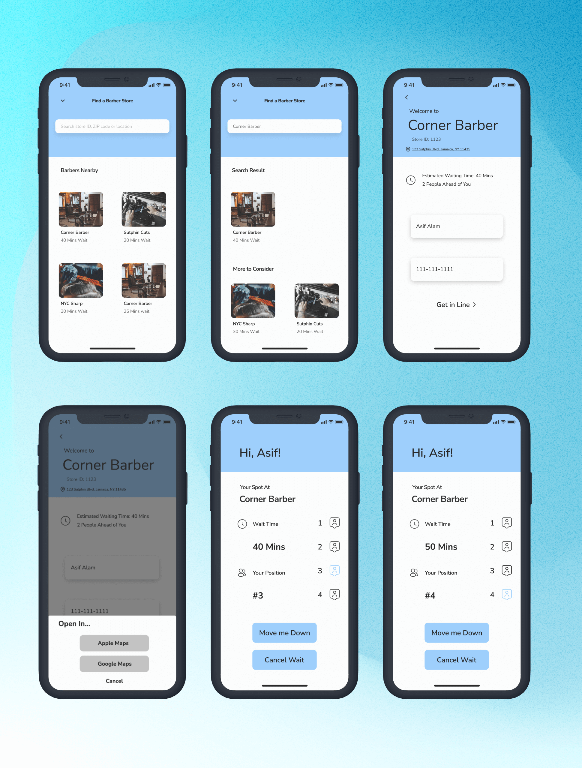
BarberQueue is a simple waitlist system that lets customers reserve a spot, see their position, and get an estimated wait time. Barbers can easily manage who’s next and keep the line fair and transparent. Customers can quickly find participating barbers nearby and check real-time wait times.
I interviewed 10 recent barbershop customers to better understand their main frustrations. Almost everyone felt the queues were disorganized, and several people mentioned being skipped, sometimes on purpose, sometimes not. This experience led some to leave and never return.
“There’s nothing more frustrating than getting skipped in a barber line because the barber wants to service someone they know first.” – SJ
“I switched barbers just because the line was disorganized.” – SM
“I wish there was a better way to keep the queue organized instead of playing a guessing game.” – AP
Created two user personas (Mike and Hamza) to focus the design on real needs.
My research showed users wanted an app to see wait times and join the queue before arriving. I quickly built mid-fidelity wireframes in Figma and tested a clickable prototype with users.
- Feedback: The app felt too crowded → Solution: Removed unnecessary buttons for a cleaner flow.
- Feedback: No way to get directions → Solution: Added quick links to Google Maps/Apple Maps.
- Feedback: Confusing search options → Solution: Clarified with instructions in the search bar.
After more testing, I designed a clean, light UI based on user feedback. No distractions, just an easy way to check in and see your place in line.
This project was my first deep dive into the design thinking process. I learned to test every assumption, validate with users, and keep the interface as simple as possible. Following real UI patterns made a huge difference in creating a seamless user experience.